AI Ads / Marketing
Performance campaigns, AI-generated creative, and paid social systems.
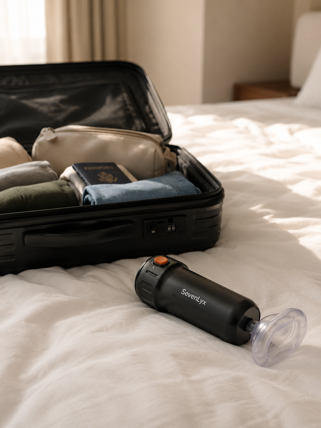
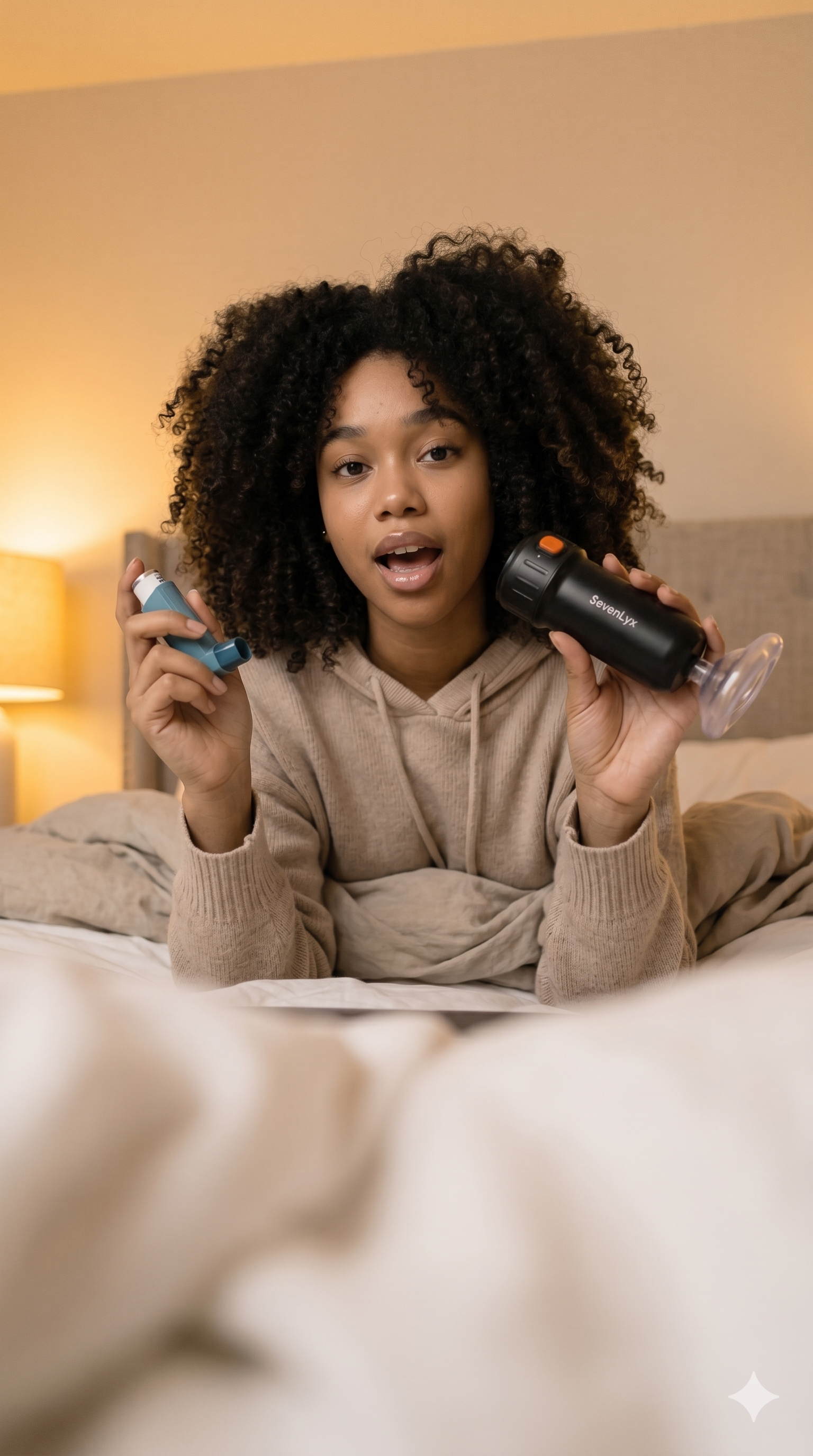
What it is. Found this on Upwork while applying for a creative strategy role. Never heard back. So I built the campaign anyway -- the full thing, from brief to assets -- to see exactly what I'd have delivered if they'd said yes.
What it does. Anti-choking rescue device. Wearable. Designed to work without a second person present, which changes where it belongs in someone's mind from "medical equipment" to "things I travel with."
Who it's for. Safety-conscious travellers and parents. People who want to feel prepared, not panicked -- the ones who already pack a first aid kit in their carry-on.
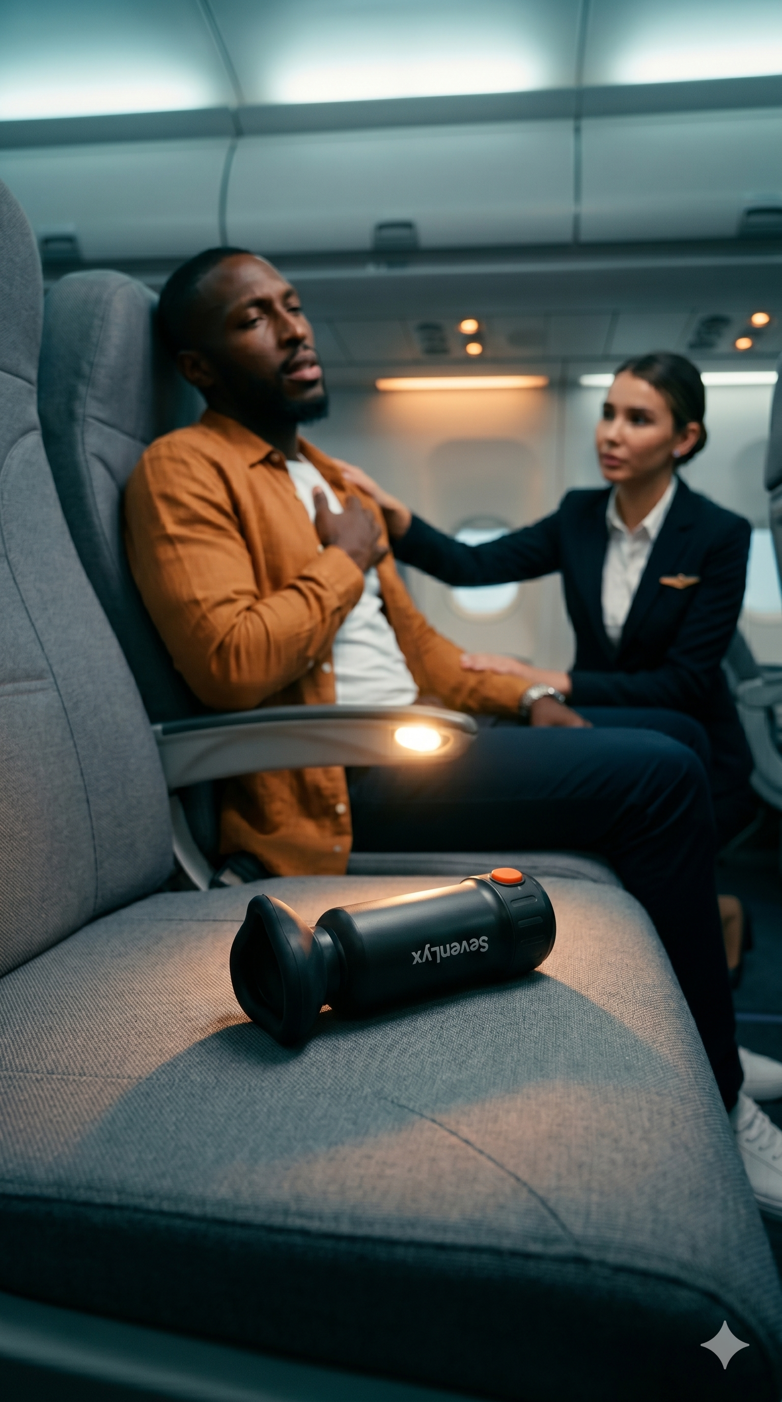
- Character cards and three scene breakdowns: travel/bag, airplane, TikTok-style UGC bedroom
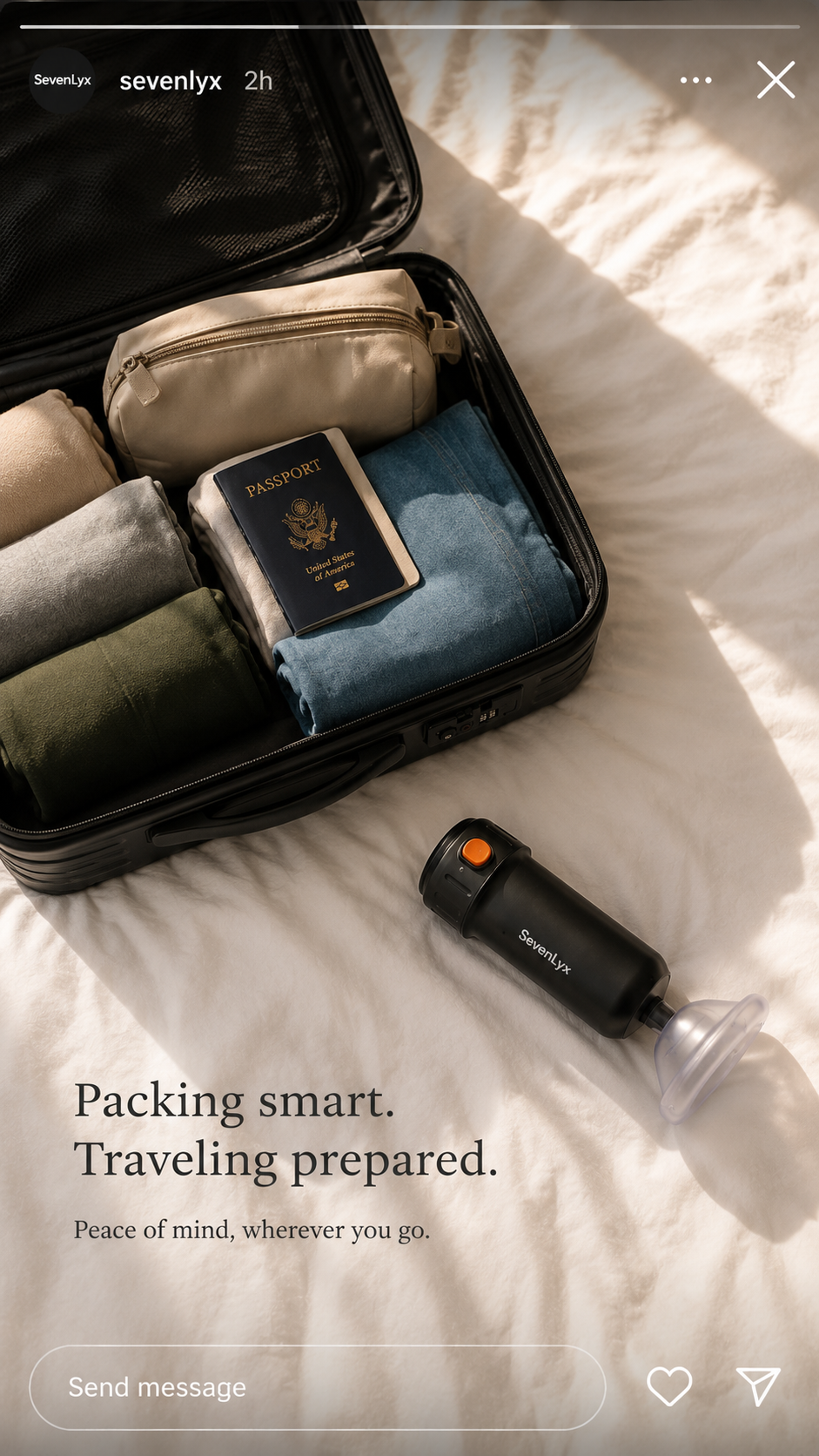
- AI-generated static ads including a passport/travel piece with the line "Packing smart. Traveling prepared. Peace of mind, wherever you go."
- Three-clip airplane emergency video storyboard and a 7-second Higgsfield UGC video
- LinkedIn post and full case study article on the portfolio
One rule: everything had to be grounded in the actual product listing, nothing invented. Spec work only proves something if it could genuinely run as is. The moment you make up specs or invent benefits, you're showing you can follow a template -- not that you can think.
- Chose image-based assets over full video once credits and time got tight. Faster posting cadence over one polished video -- I think that was the right call.
- Framed the product around travel moments, not medical framing. That's where the emotional hook lives. Nobody wants to think about choking -- but everyone has packed a bag for a flight.
Built the brief from the live Shopify listing, developed characters and scenes, generated static and video assets, then published as a LinkedIn post and a full case study. The whole thing ran on no client relationship and no budget -- which was kind of the point.
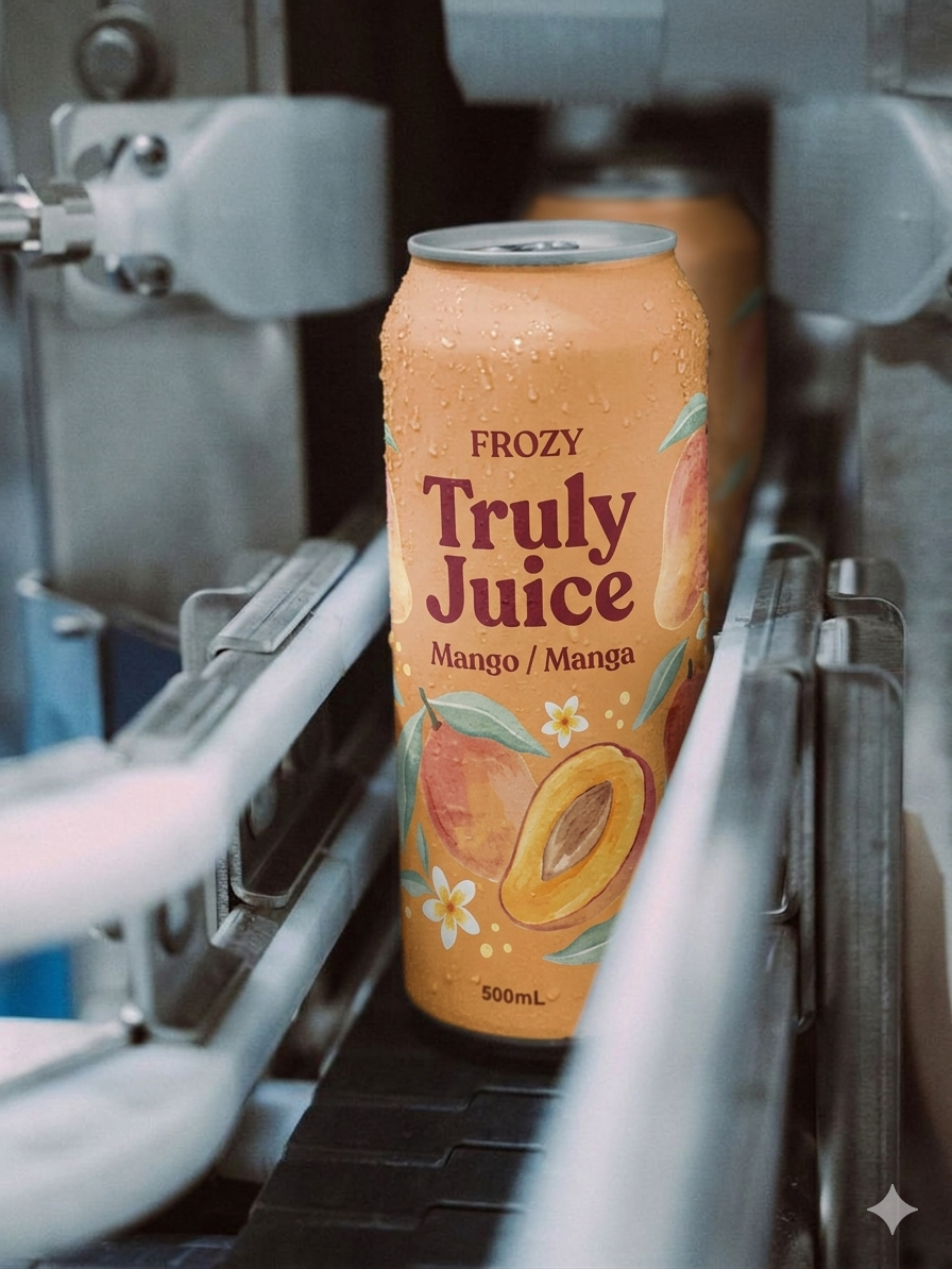
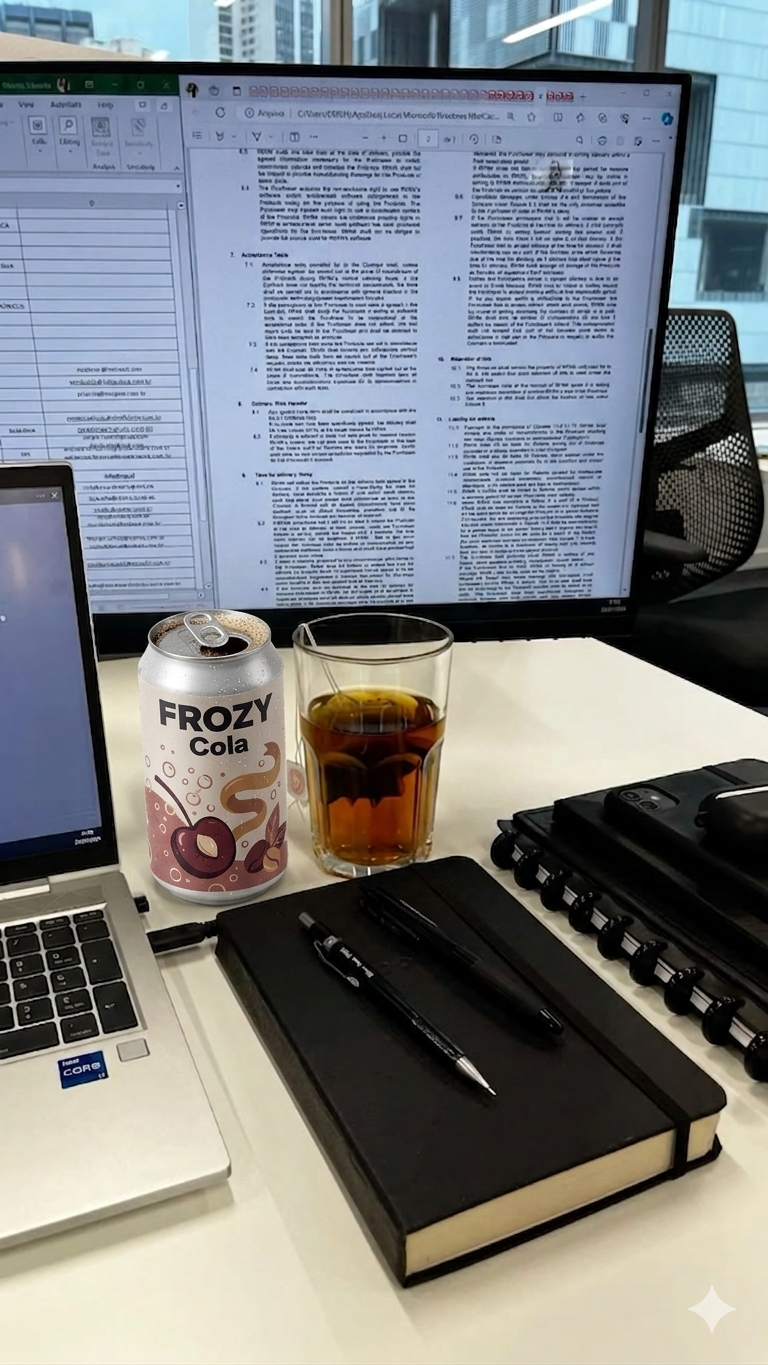
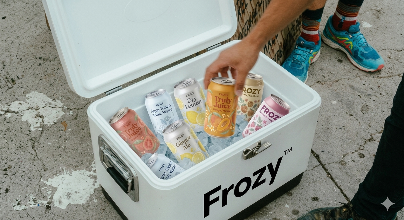
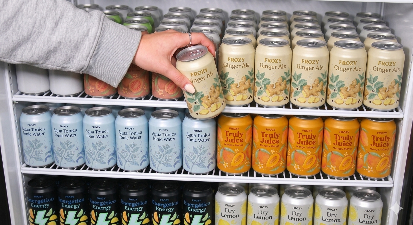
What it is. The lead came in through Katlego -- he'd met someone at an event. Frozy is owned by Yaafico Industrial, Mozambique's largest soft drink manufacturer, distributed in SA by Lunem Beverages. Real brand. Warm lead. Before the deal was confirmed, I built the whole pitch stack.
What it does. Multi-flavour soft drink range -- Ginger Ale, Tonic Water, Truly Juice Mango, energy, Dry Lemon. The play in SA isn't competing on taste, it's the Mozambican origin story. That's what differentiates it.
Who it's for. SA consumers who want a personality behind what they're drinking. Something with an actual story, not another generic fizz in a can.
- Formal proposal (DOCX + PDF) with three pricing tiers: R6,000 / R10,000 / R12,000 + R15,000 once-off
- Brand Intelligence Report benchmarking Cadence, "Update" by Kim Kardashian, and Coca-Cola's 2025 strategy to find Frozy's actual position in the market
- AI-generated packaging and flavour concept imagery across the range
- Four-week Instagram campaign ("Taste of Moz") -- 9 lifestyle images, 3 videos, ready-to-post captions
My logic was simple: showing a client exactly what a Nental engagement looks like closes faster than describing it. So I built everything before anyone signed anything. The Brand Intelligence Report gave the pitch a research backbone instead of just vibes and moodboards -- if you're going to recommend a positioning, you should be able to show your working.
- Three pricing tiers instead of one flat number. Let them self-select their level of commitment rather than face a take-it-or-leave-it price.
- Built "Taste of Moz" entirely around Frozy's Mozambican origin. That's the one thing no SA competitor can copy.
Research and brand intelligence first, then proposal and pricing, then campaign architecture and asset production. Pitch sent. [CONFIRM: whether Frozy has signed -- will update this once confirmed.]
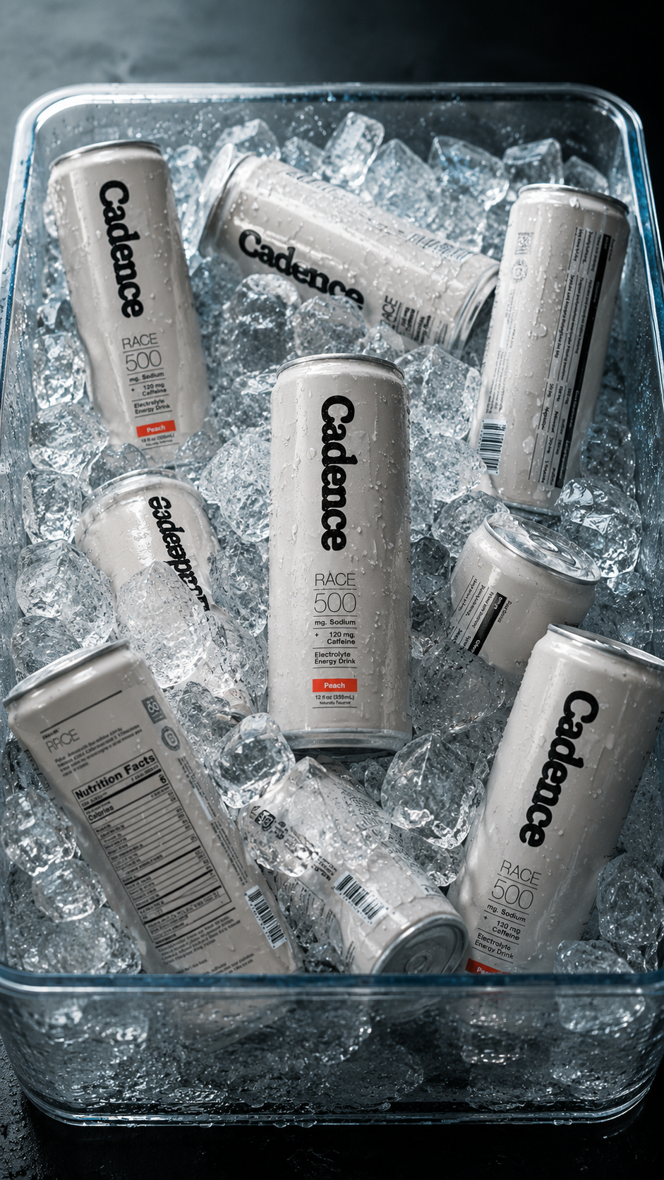
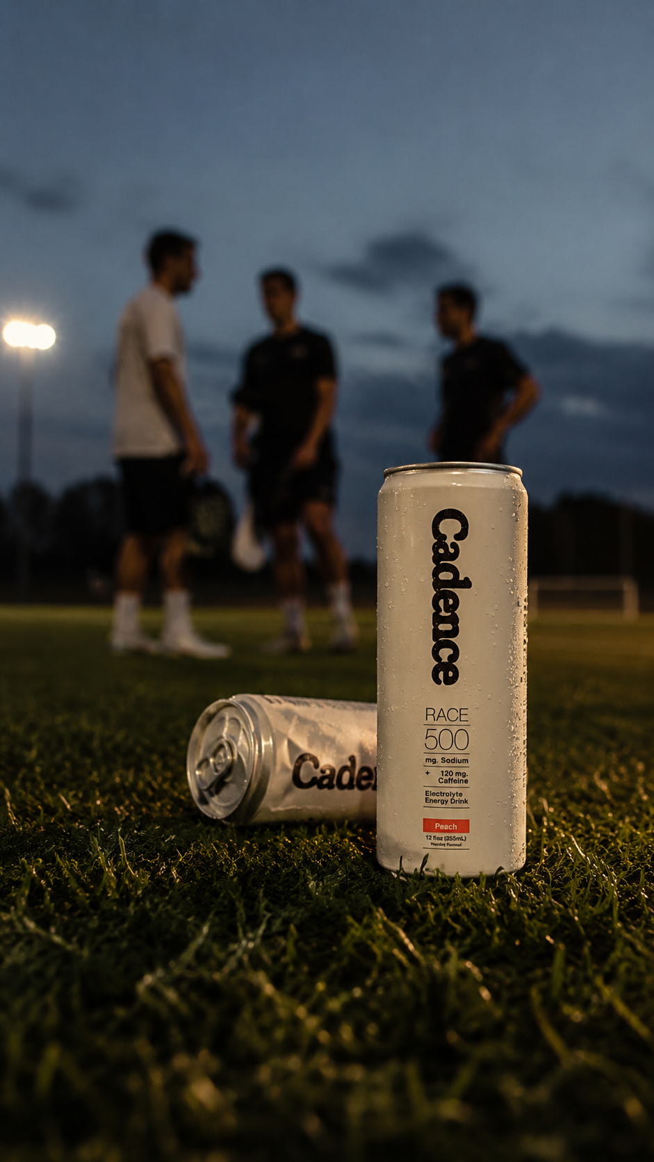
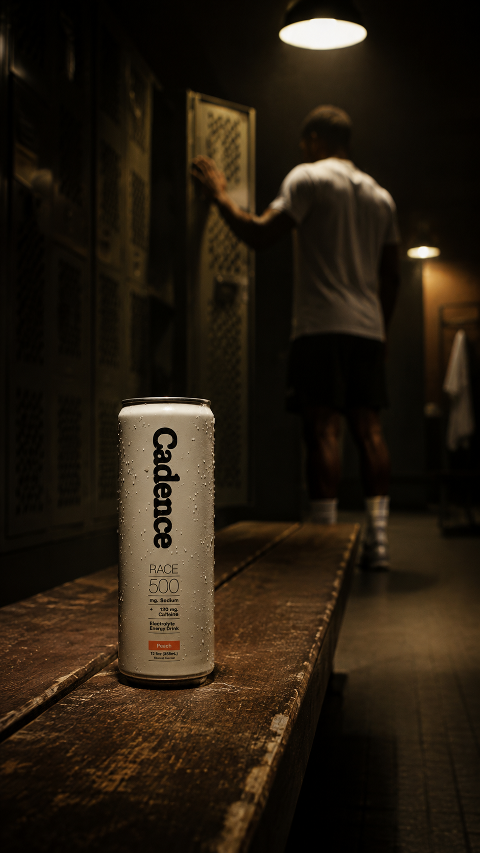
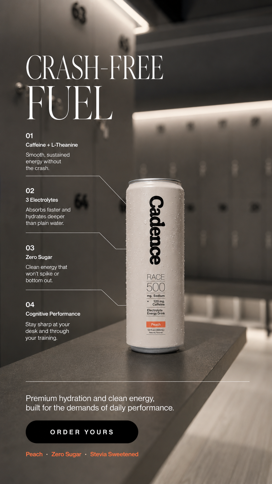
What it is. This came through Kay Radebe's Strategist Society -- a creative strategy community that runs real briefs as exercises. The Cadence brief was live; I worked it as creative strategist. Spec work, but a real brief from a real brand.
What it does. UK electrolyte energy drink. George Heaton. Clean caffeine plus L-theanine, three electrolytes, zero sugar. The angle is "crash-free fuel" -- cognitive performance, not bro-culture energy.
Who it's for. Men 20 to 35 who train but aren't performative about it. The guy who finished a 5-a-side match and wants something that doesn't taste like a chemistry lab.
- Direct-response F/B copy pulled entirely from Cadence's own product page -- no invented claims
- Full brand visual identity extraction: Editorial New and Neue Montreal, black/white palette with peach accent, black pill CTA
- Four image generation prompts: low-angle field shot, can in ice water, locker room bench, locker interior still life
- Two-video edit plan structured around the four stills
The strategic question wasn't what Cadence does -- it was where it belongs. I kept landing in the locker room. After the final whistle, not mid-match. That's the specific moment where this product makes sense, and once I found it, the creative followed naturally. Think space first, then let the product fit into that world.
- Every claim came from Cadence's actual product page. Direct-response copy that overstates a real product is the fastest way to lose trust -- and the fastest way to prove you didn't do your homework.
- Locked the visual identity to their existing typefaces and peach accent. The spec work needed to feel like it could actually slot into their real marketing, not like an outsider's interpretation of it.
Product page deep-dive first, then F/B copy, then brand identity extraction, then campaign image prompts structured into a two-video edit plan. The whole thing ran in sequence -- I don't start on creative until the copy thinking is done.
What it is. Unprompted. No brief. I picked Aesop specifically because it's one of the hardest brand voices to write for -- restrained, declarative, never shouts. If I could write something that could plausibly slot into their actual marketing, that tells me something real about where I am.
What it does. Australian skincare. Ingredient-first. Every formulation is built around what's actually in it, not what the packaging looks like. That's the whole brand logic -- and it shows in how they write.
Who it's for. People who read labels. Adults tired of beauty marketing that treats them like they won't notice the difference between a product and a promise.
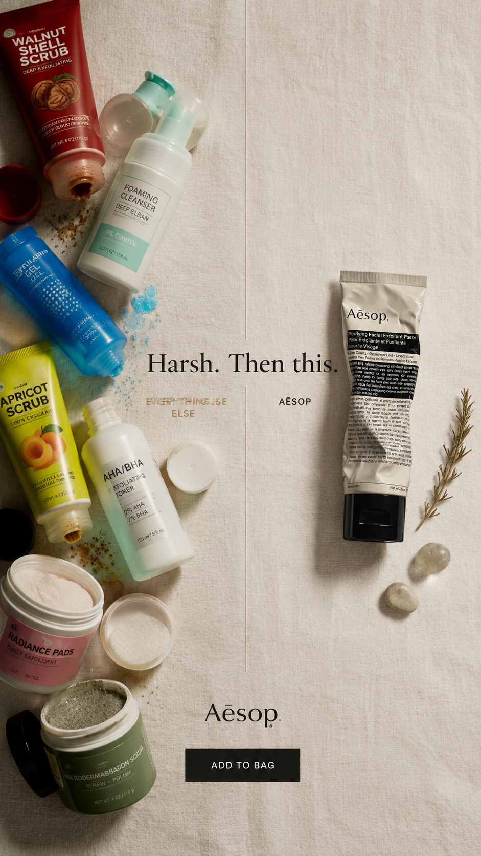
- Competitive contrast ad: "Harsh. Then this." -- visual chaos versus calm, positioning against the category without naming anyone
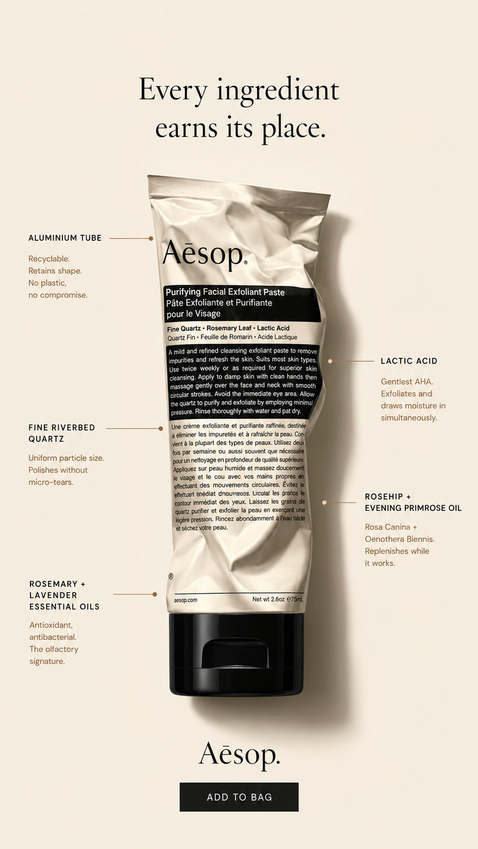
- Ingredient transparency ad: "Every ingredient earns its place." -- names fine riverbed quartz, lactic acid, rosehip, evening primrose oil
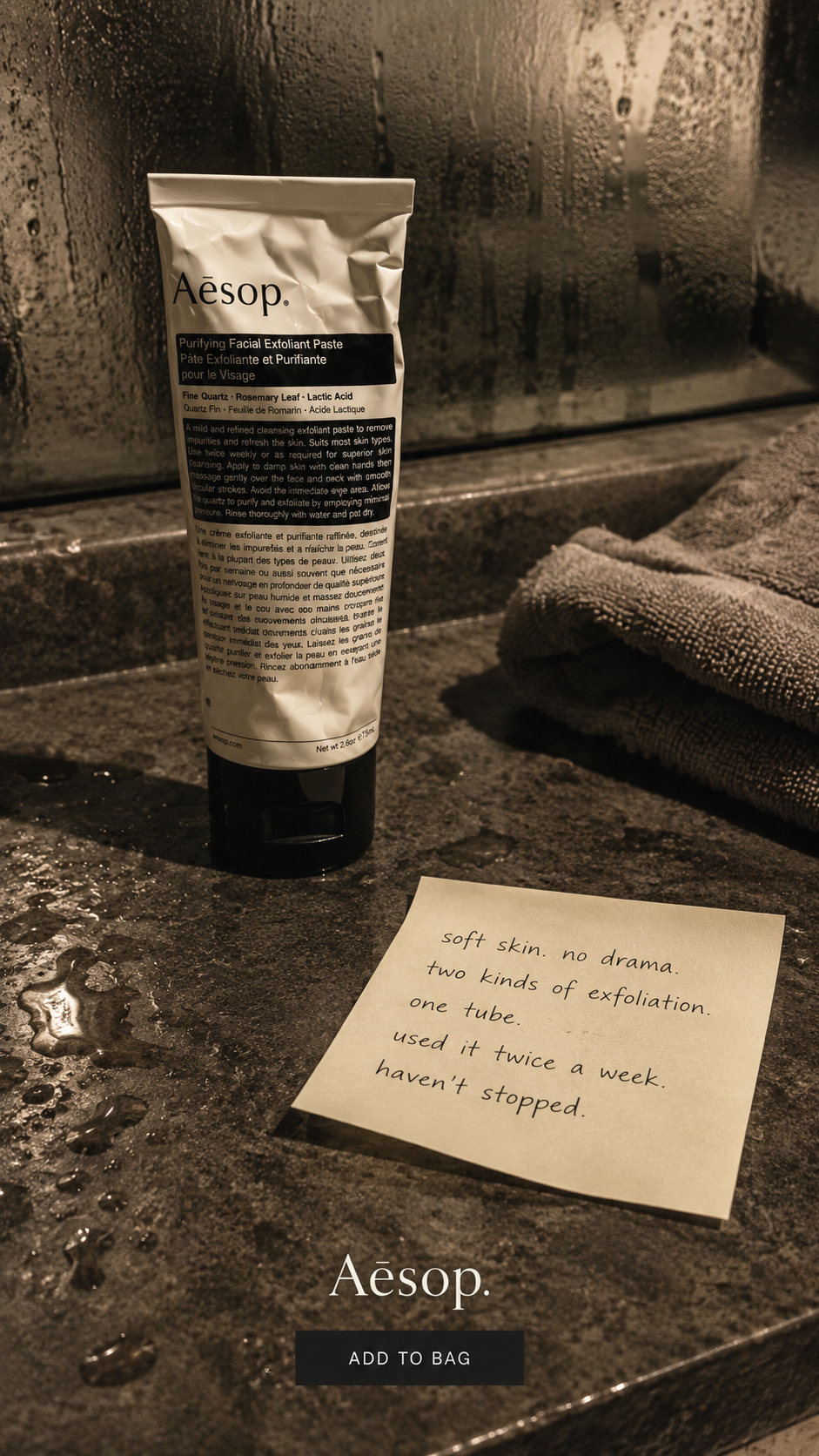
- Human testimony ad styled as a sticky note: "soft skin. no drama." -- deliberately unpolished
Aesop trusts their audience to get it without being told twice. So the work had to earn that same trust. I structured it as three separate funnel positions -- contrast, proof, testimony -- because no single ad should try to do all three jobs. They only work together. Individually, each one has a clear job and stays in its lane.
- Matched Aesop's actual register -- restrained, declarative, ingredient-first. Injecting a louder beauty-ad tone would have broken their logic. The voice is the brief.
- Deliberately made the testimony ad look unpolished against the other two. Manufactured imperfection is exactly what makes that kind of proof read as real, not staged.
Identified the three funnel positions first, then wrote and art-directed each one to its specific job. I didn't know if I nailed the Aesop voice -- that's genuinely hard to self-assess. But I think the funnel logic is sound, and I'd build the same way again.